
 {loadmoduleid 368}
  {loadmoduleid 368}
  {loadmoduleid 368}
  {loadmoduleid 368}
  {loadmoduleid 368}
  {loadmoduleid 368}
  {loadmoduleid 368}
 {loadmoduleid 368}
  {loadmoduleid 368}
  {loadmoduleid 368}
  {loadmoduleid 368}
 {loadmoduleid 368}
  {loadmoduleid 368}
 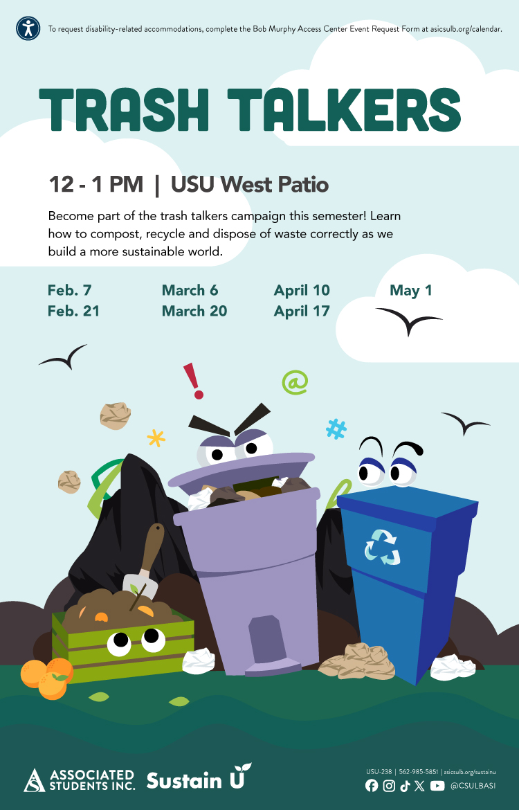 {loadmoduleid 368}
 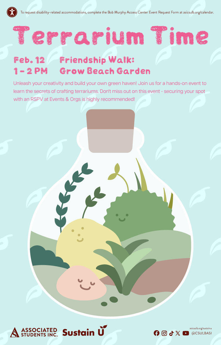 {loadmoduleid 368}
  {loadmoduleid 368}
  {loadmoduleid 368}
  {loadmoduleid 368}
  {loadmoduleid 368}
  {loadmoduleid 368}
  {loadmoduleid 368}
  {loadmoduleid 368}
  {loadmoduleid 368}
 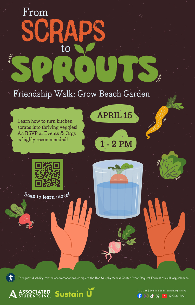 {loadmoduleid 368}
  {loadmoduleid 368}
  {loadmoduleid 368}
  {loadmoduleid 368}
  {loadmoduleid 368}
  {loadmoduleid 368}
  {loadmoduleid 368}
  {loadmoduleid 368}
  {loadmoduleid 368}
  {loadmoduleid 368}
  {loadmoduleid 368}
  {loadmoduleid 368}
  {loadmoduleid 368}
  {loadmoduleid 368}
  {loadmoduleid 368}
  {loadmoduleid 368}
  {loadmoduleid 368}
  {loadmoduleid 368}
  {loadmoduleid 368}
  {loadmoduleid 368}
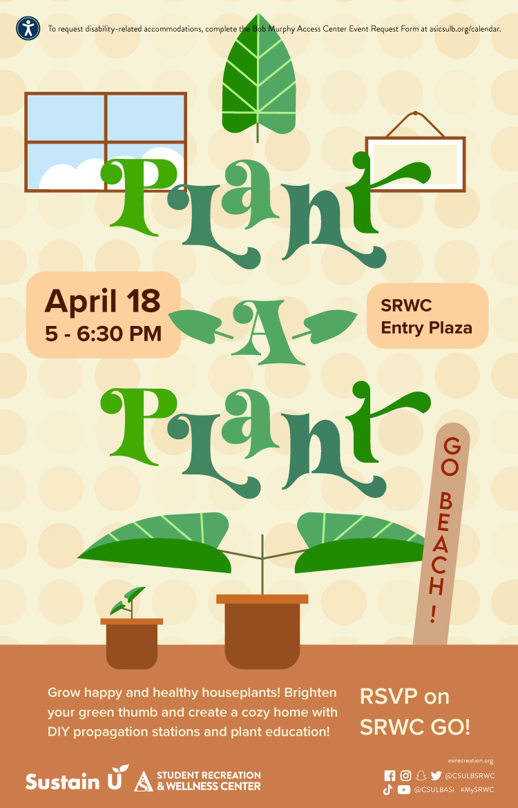
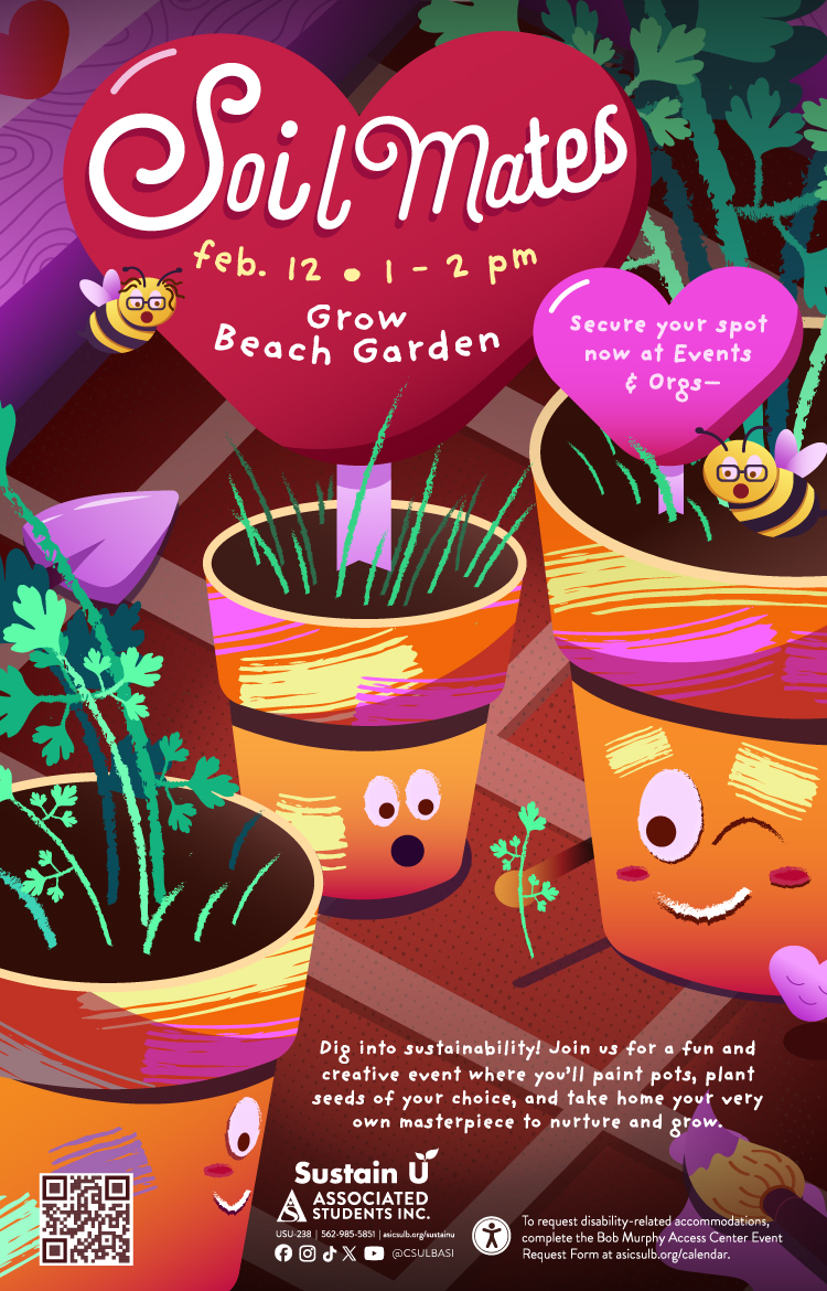
Date
Feb. 12

Location
Grow Beach Garden

Time
1 - 2 p.m.
Description
Immerse yourself in creativity and sustainability at Soil Mates, a spring event celebrating growth in the vibrant Grow Beach Garden. Paint your own pot, plant the seeds of your choice, and take home a personalized piece of nature to nurture and enjoy. Reserve your spot now on Events & Orgs.
 {loadmoduleid 368}
  {loadmoduleid 368}
  {loadmoduleid 368}
  {loadmoduleid 368}
  {loadmoduleid 368}
  {loadmoduleid 368}
  {loadmoduleid 368}
  {loadmoduleid 368}
  {loadmoduleid 368}
  {loadmoduleid 368}
 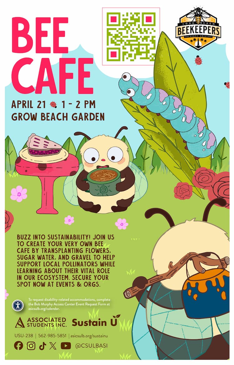 {loadmoduleid 368}
  {loadmoduleid 368}
  {loadmoduleid 368}
  {loadmoduleid 368}
  {loadmoduleid 368}
  {loadmoduleid 368}
  {loadmoduleid 368}
  {loadmoduleid 368}
  {loadmoduleid 368}
  {loadmoduleid 368}
  {loadmoduleid 368}
  {loadmoduleid 368}
  {loadmoduleid 368}
  {loadmoduleid 368}
  {loadmoduleid 368}
  {loadmoduleid 368}
  {loadmoduleid 368}
  {loadmoduleid 368}
  {loadmoduleid 368}
  {loadmoduleid 368}
  {loadmoduleid 368}
  {loadmoduleid 368}
  {loadmoduleid 368}
  {loadmoduleid 368}
  {loadmoduleid 368}
  {loadmoduleid 368}
 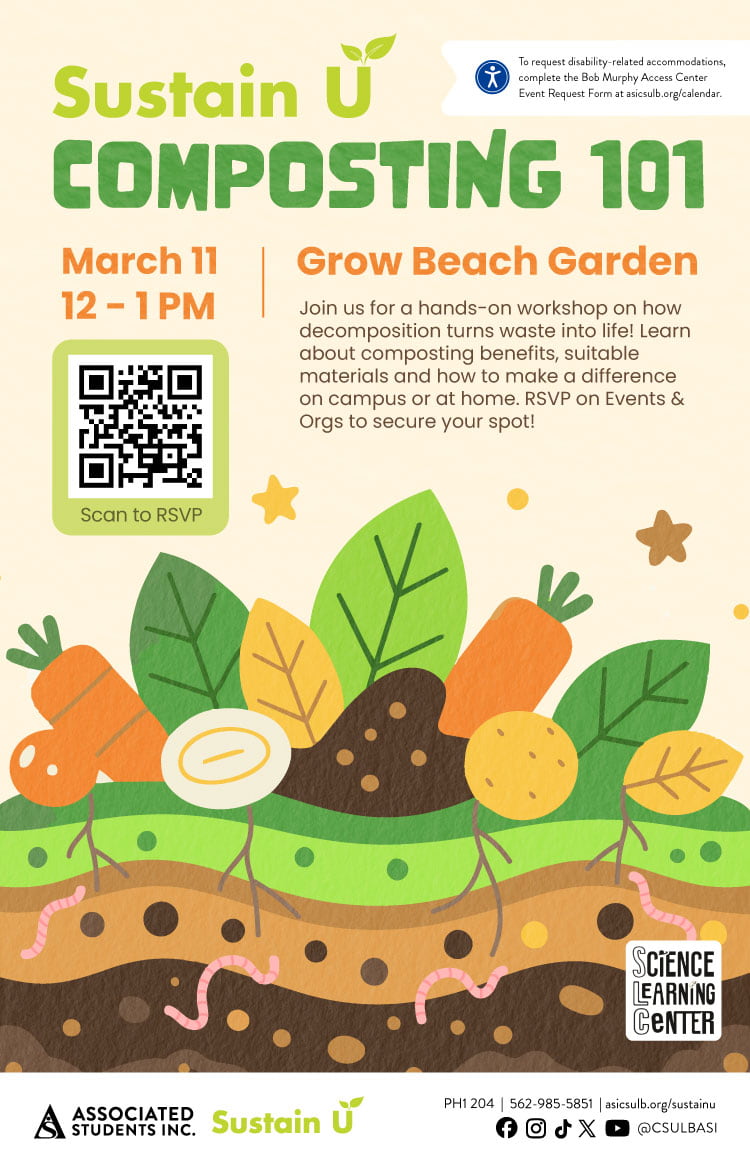 {loadmoduleid 368}
  {loadmoduleid 368}
  {loadmoduleid 368}
  {loadmoduleid 368}
 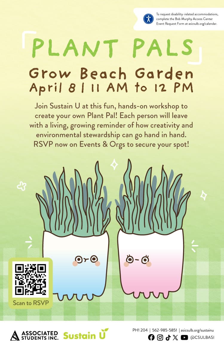 {loadmoduleid 368}
  {loadmoduleid 368}
  {loadmoduleid 368}
  {loadmoduleid 368}